Year
2026
Client
In house Portfolio
Category
Food and Beverage
Product Duration
3 Weeks
The project kicked off with a vision from Abhilash and a completely blank sheet of paper. From there, we immediately began exploring visual directions and identity names. After deep conceptualizing, we chose the name Cube & Co. a direct reflection of the product's geometry, where every single mithai is a perfect cube, and every box we engineered mirrors that same structural form. We sketched extensively, focusing heavily on how the brand could feel modern, festive, and memorable without relying on the usual visual clichés associated with traditional Indian sweet packaging.
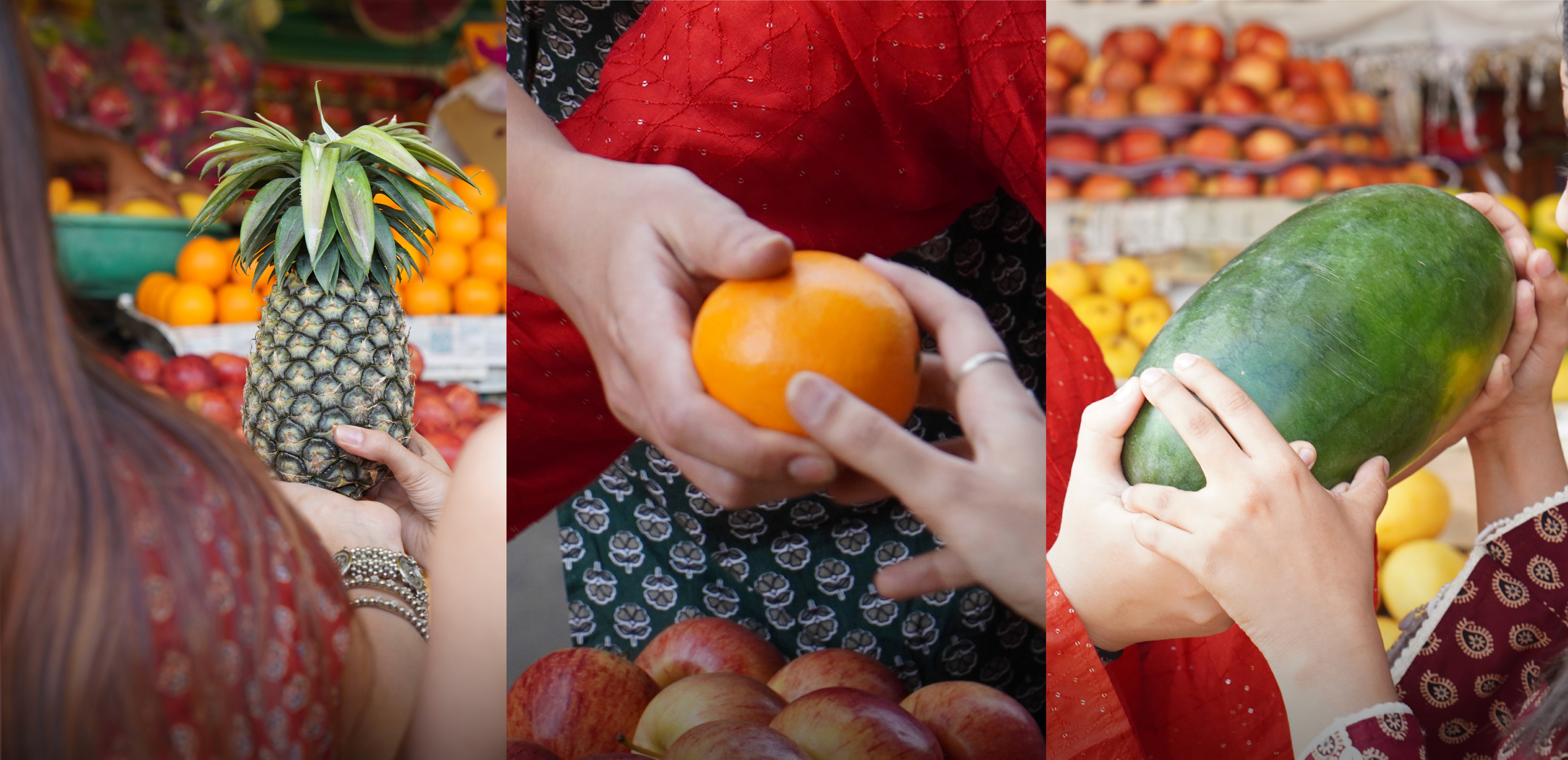
In the process of the project, we wanted to step away from predictable digital swatches. We spent mornings in local fruit markets, observing mangoes, oranges, and strawberries in natural light. Not for flavor cues, but to capture the raw, organic character of their colors. Honestly, looking at real-world interactions with light hits completely different than a Pantone book.
The final palette came directly from those market observations, helping us define five distinct flavor variants: Mango Bites, Strawberry Bites, Orange Bites, Meva Bites and Chocolate Bites.

Our solution for the canvas was to lean heavily into pure materiality, starting with Sona Paper Black and Texture 97. A premium uncoated stock that gives the matte black canvas an unexpected sense of depth & sophistication. Then came the structural engineering. It took five to six intense iterations of prototyping the dyelines, testing precise measurements, machine cutting, and creasing, before we finally perfected the geometry. We locked in two distinct sizes: a 2.7-inch single-bite box for personal, quiet indulgence, and a 4.2-inch four-bite format for gifting and shared celebrations.
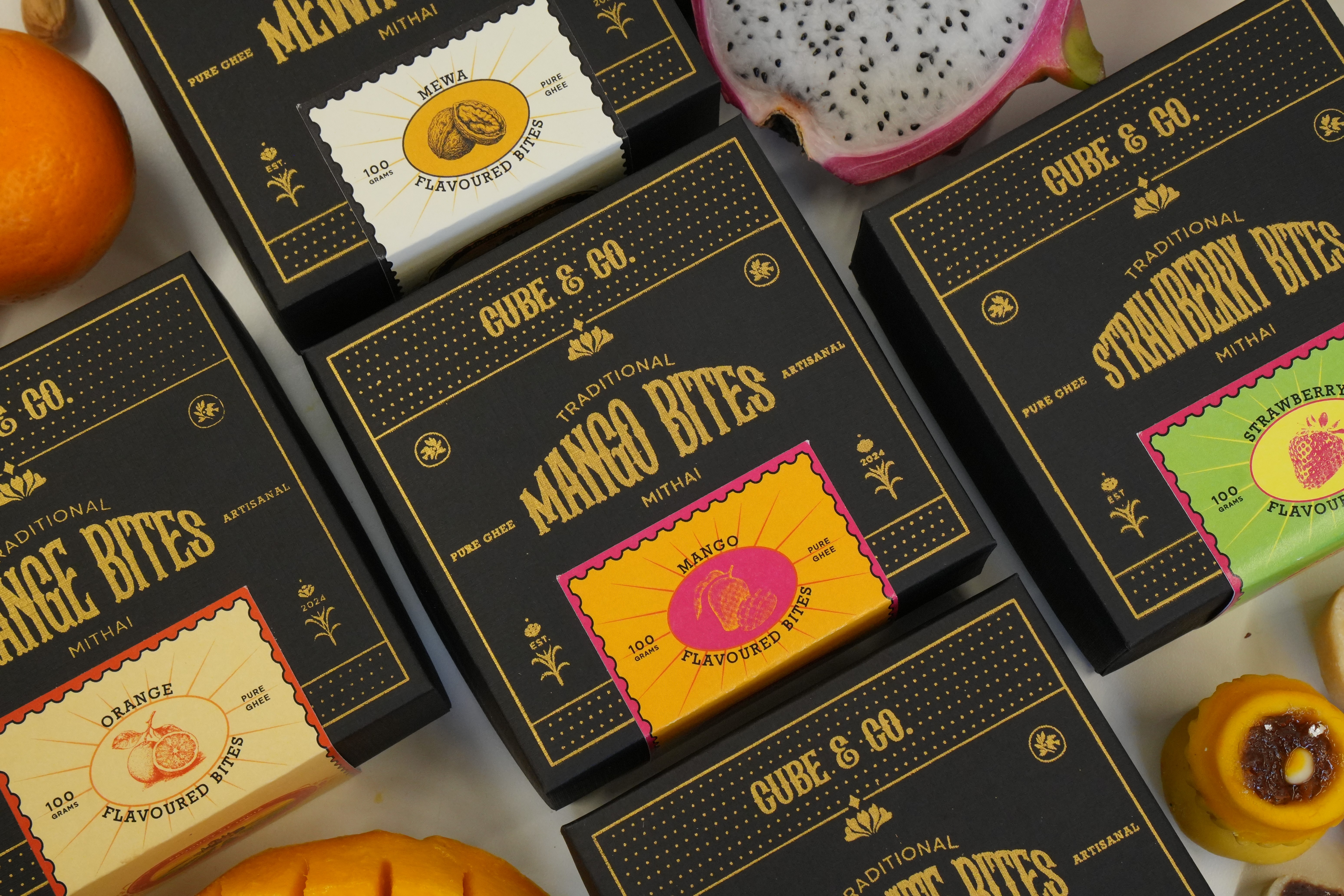
Next was the core layout design. Against that deep black structured surface, we knew the gold details would feel quietly elegant and timeless rather than loud. It’s that perfect, understated premium energy for the main box. To balance this across our five flavor profiles, we designed specialized tickets for the four-bite box and tailored sleeves for the single-bite format, introducing five distinct color combinations tailored to each flavor. These elements were engineered specifically to enhance the contrast between the deep black and gold, highlighting the finer details printed right onto the ticket.


For the visual layout of the four-bite box, we decided to work primarily with clean typography and minimal highlighting elements. For the single-bite box, we shifted the focal point to a flavor-specific graphic element dead center, grounding the composition with custom "Cube & Co." typography rendered in Devanagari/Hindi script.
To bring this typographic system to life, we chose Albertson (Regular) as our primary typeface, paired with Pogonia (Light) as our secondary, while the Devanagari branding was set in the striking Matangi (Bold). The central motif tying the narrative together is the lotus, a core visual element we used to highlight celebration, festive joy, happiness, and purity. With these identity systems aligned, the layout design was finally The biggest technical roadblock, however, was achieving the exact gold finish we had envisioned. Traditional foil stamping just wasn't sitting right on the heavily textured paper. After extensive prototyping and experimentation, we developed a custom screen-printing process that allowed the gold ink to sit beautifully on the surface while preserving the raw tactile quality beneath.


Getting the execution right meant six days of continuous, grueling print work. Across ten total designs, we ran two setup attempts for each, exposing 20 individual screens, washing 20 screens, and pulling 40 total prints to hit perfection.
Once the screen-printed final prints were dry, we moved them back to the a UC 400 machine for precise creasing and cutting. Parallelly, we ran the final prints for the sleeves and tickets on a printing machine, yielding physical outputs that perfectly matched our digital designs. Then came the ultimate test of patience and time: the final sticking and pasting. To maintain absolute quality control, every single box in the final collection was assembled by us by hand. It required immense focus to align every edge with absolute precision, but piece by piece, the collection finally came together.


When it came time for documentation, we shot everything in warm, natural light to keep the imagery completely honest. To build the visual world for the shoot, we chose real fruits, dried fruits, and rich chocolate for our propping. A curated selection perfectly aligned with our five primary flavor profiles. In the final frames, the matte black remains deep and understated, the gold responds naturally to the sun, and the sweets bring the warmth.
Ultimately, this project was never about just making a box. It was about elevating a narrative around a ritual people already love, the art of sharing sweets.


