Year
2026
Client
IN HOUSE PORTFOLIO
Category
COFFEE | FOOD & BEVERAGES
Product Duration
4 WEEKS
The project faced a noisy landscape of illustrated coffee packaging, presenting immediate roadblocks when translating a minimal digital layout into physical form. Early prototypes revealed a malfunctioning tuck-locking mechanism, while initial production trials with textured Sona Paper caused the material to buckle and crack during creasing, compromising the sharp geometry the design demanded.
Instead of creating another conventional coffee box, the objective was to craft a canvas that embraced structural restraint and pure geometry over loud decoration. Rooted deeply in the rich, coffee-growing landscape of Malenadu, Karnataka, the name Malen anchors the brand narrative in raw geographic authenticity. By prioritizing precise spatial proportions and deliberate material choices, the packaging communicates a quiet luxury, proving that a brand can command an undeniable presence through absolute restraint.
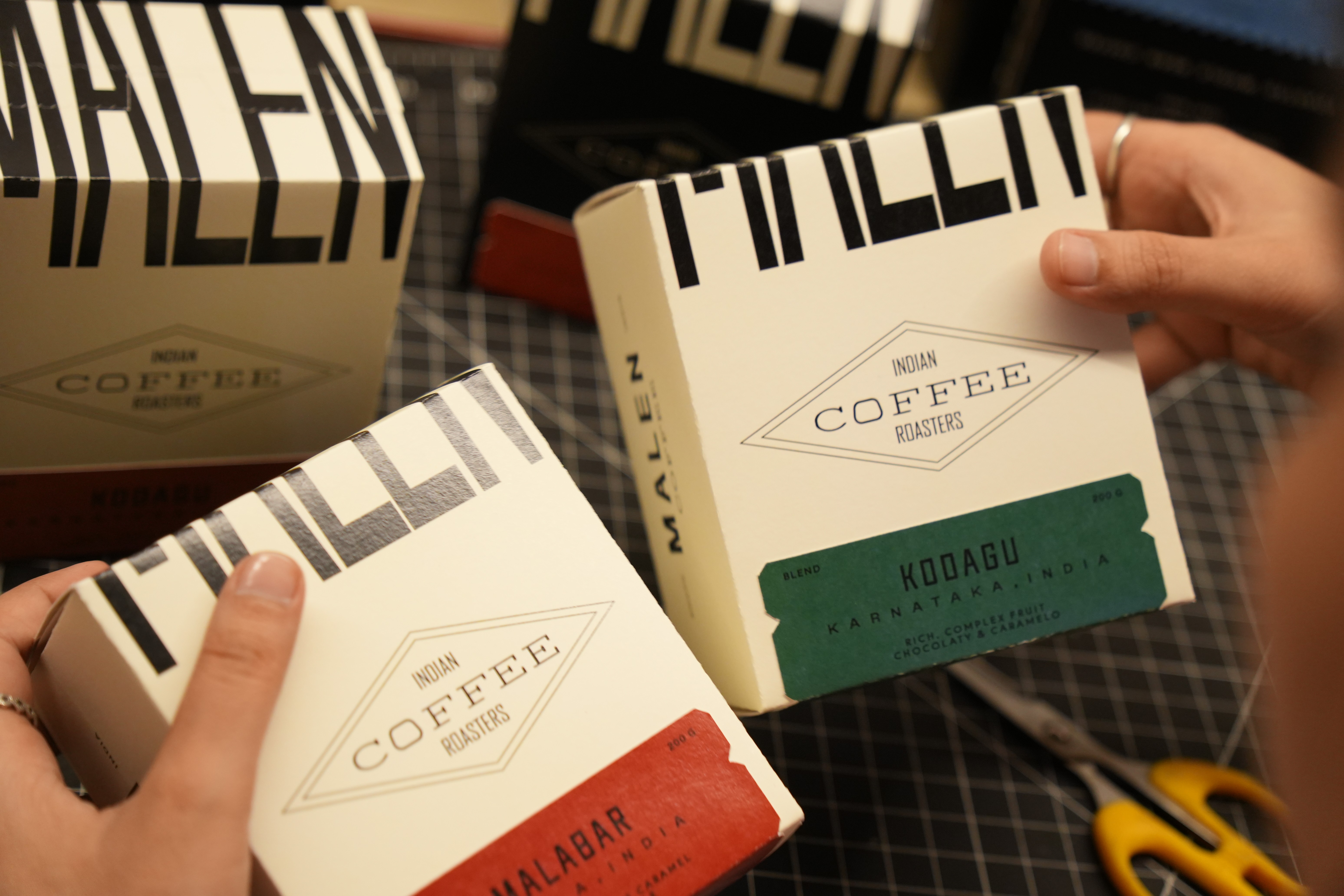
The foundation of the visual identity rests on the stretched MALEN wordmark, an intentional study of spatial balance and clean form rendered in Ocklyn (Regular). By stretching the typography, the logo mirrors the architectural intent of the brand, serving as an authoritative focal point that grounds the minimalist composition without relying on supplementary graphic elements.
To balance the hero wordmark and establish a clear, organized hierarchy across the packaging architecture, a meticulous typographic system was developed. Agency FB (Regular) provides a sharp structure for "Indian Coffee Roasters," while the utilitarian aesthetic of Courier New (Regular) delivers the technical data. The brand's narrative prose is carried by Haniva (Book), while Rumeno (Medium) and Rumeno (Light) are deployed to ground the flavor and origin systems, ensuring the layout remains highly contemporary and easy to navigate.

To bring this identity into physical reality, specialized flavor tickets were engineered for the box alongside tailored sleeves. These structural elements were designed to create moments of sudden graphic contrast against the deep black surface, introducing vibrant color metrics to an otherwise deeply restrained canvas.
The final execution required five to six intense iterations of structural dielines in Adobe Illustrator to perfect the folding physics, followed by three full production trials to correct shifting print colors. The collection was manufactured in-house using the Xerox PrimeLink, and to maintain absolute quality control, every single box was creased, folded, and pasted entirely by hand.

The color strategy leans heavily into the relationship between understated depth and vibrant contrast, utilizing a deep, matte black canvas alongside a crisp off-white canvas. By pivoting to Texture 97 paper, the architecture beautifully handles structural folding while preserving a rich, sophisticated surface quality that responds naturally to light. Against this restrained backdrop, five distinct color combinations on specialized tickets inject targeted moments of color, highlighting the technical details while amplifying the premium energy of the dual-toned typographic forms.


This project was realized over an intensive process of refinement, resulting in a packaging system that successfully elevated a daily ritual into an elevated sensory experience for a highly satisfied client. Ultimately, this new visual direction serves as an essential stepping stone, grounding Malen in a sophisticated, design-led future.


Creatively directed by Angel and Shruti and captured by Vedant and Shivang, the photoshoot used warm, natural light to maintain absolute material honesty. Propped simply with real coffee beans to ground the brand in its geographic origins, the minimalist compositions allow the design to speak for itself. In the final frames, the matte black and off-white canvases remain beautifully understated, the typography reigns as the hero, and the vibrant flavor tickets respond naturally to the sun


Ultimately, Malen Coffee is more than a packaging project. It is an exploration of how thoughtful design can elevate an everyday object into something memorable. Through typography, structure, materiality, and careful refinement, the project creates a packaging experience that feels contemporary yet timeless, minimal yet rich, and deeply connected to the place from which its story begins. From the earliest sketches and structural explorations to production testing, material experimentation, and final photography, every stage contributed to a single objective: creating a coffee package that feels worth keeping.